
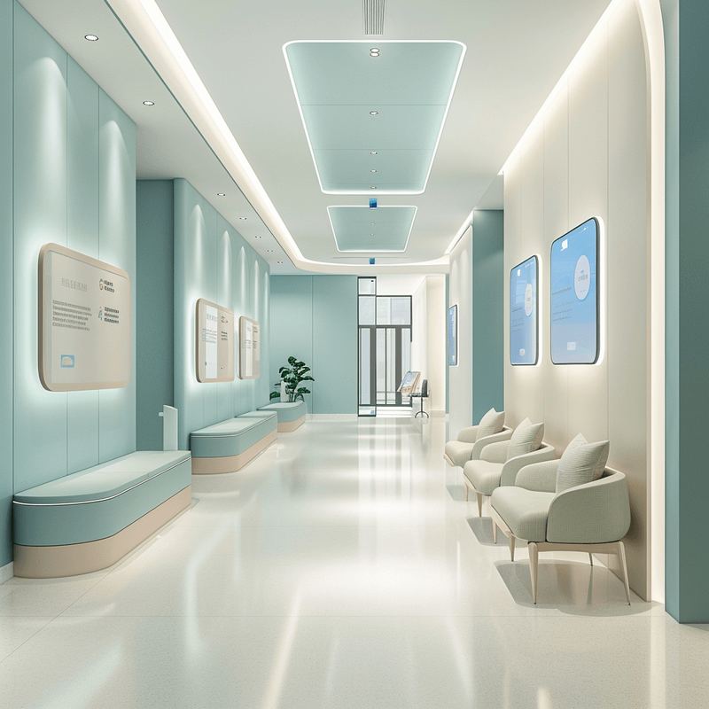
A modern medical clinic is not only a place where professional care is provided, but also a space where patients expect comfort, attention and convenience. One of the key elements shaping the overall impression of a visit is visual navigation. At first glance this may look like a secondary detail, but in practice it is a powerful tool for improving the patient experience, affecting both the emotional state of patients and the efficiency of the staff.
Visual navigation is a system of elements that helps visitors orient themselves in a space quickly and easily. It includes signs, waiting areas, room markings, infographics, colour schemes and even lighting. Without clear navigation a patient can feel lost, which causes stress and sometimes irritation — especially for someone visiting for the first time or feeling unwell.
Good navigation makes it possible to:
- Reduce stress. Clear signs remove the need to ask staff for directions, which matters especially to introverts and to people in a hurry.
- Speed up movement through the space. Patients find the rooms, labs or rest areas they need faster.
- Support the clinic’s overall image. Well-kept, well-designed navigation signals that the clinic pays attention to detail and cares about its patients.
Principles of good navigation
Simplicity and clarity. Navigation should be intuitive. Use universal symbols and a minimum of text. A stethoscope icon, for instance, immediately reads as a doctor’s office, while a cup suggests a rest area. Where text is necessary, make sure it is set in a large type size and in plain language.
Contrast and colour accents. Colour plays a key role. Blue might mark therapy rooms, green the laboratories, yellow the waiting areas. Contrasting colours and a legible typeface improve visibility even for people with impaired vision.
Logical placement. Signs and zones belong at the key points of the patient’s route: at the entrance, in corridors, near lifts and stairs. The logic of moving through the clinic should be self-evident — from reception to the waiting areas, then to the rooms and out.
Aesthetics and brand fit. Navigation is not only functional; it is part of the clinic’s visual identity. Signs, reception desks and fascias should follow the brand: its colours, typefaces and graphic elements. That is what makes a space feel coherent.
Accounting for different groups of patients
It is worth remembering that a clinic is visited by people with very different physical abilities and needs. That calls for:
- Signs placed at eye level, including for wheelchair users.
- High-contrast lettering for patients with poor eyesight.
- Additional audio cues duplicating the visual ones for the visually impaired.
Navigation as part of the patient journey
Navigation should not be treated as a standalone element. It is part of the overall patient journey — the sequence of interactions with the clinic from entering the building to leaving it. For example:
- At the entrance the patient is met by a digital terminal showing a map of the clinic.
- Clear signs then help them find reception, the waiting area or the right room.
- In the waiting area, infographics explain the order of procedures while a digital board shows the current queue.
- On the way out, navigation elements help them orient towards nearby transport or parking.
Every touchpoint has to connect logically, so that the patient feels confident and at ease.
Examples
Mayo Clinic (USA). Across this network, navigation is built on patient-centred design. Zones and signs are not only clear but calming, thanks to warm colours, soft lighting and contemporary typefaces.
Shinkansen Hospital (Japan). Here navigation relies not only on traditional signs but on digital screens with interactive maps that help the patient pick the best route.
Skolkovo Medical Centre (Russia). Navigation is integrated with the branding: signs use the corporate colours, and waiting areas carry infographics that help patients understand the diagnostic process.
In summary
Patients rarely realise how much navigation shapes their overall impression of a clinic. But when signs are missing or awkward, irritation and distrust follow immediately. Thoughtful navigation, by contrast, creates the sense that the clinic cares about its patients down to the smallest detail.
Visual navigation is not merely a practical tool — it is a powerful part of building the patient experience. By investing time and resources in it, a clinic both makes life easier for patients and strengthens its reputation as a modern, attentive medical institution.